Ad viewability answers the following question: How many served ads are actually seen by users?
The widely agreed definition ad viewability comes from the Interactive Advertising Bureau (IAB) and Media Rating Council, whereby an ad impression is considered viewable if:
- For display ads, 50% of the ad’s pixels are visible for at least 1 second
- For video ads, 50% of the ad is visible for at least 2 seconds
There are numerous factors that affect viewability and that should be considered while trying to boost the number of views that your ads get.
Here are some of the key factors that can help you boost your ad viewability:
Avoid Top Ad Placements
Most sites have top-of-the-page placements, but these ads tend to underperform in viewability, so consider avoiding them.
Most users scroll past the top placement in search for the content that they are looking for, a problem that is further exacerbated on web pages that take a long time to load
Placements that are created on-the-fold and just above-the-fold tend to be the most viewable
Work on Reducing Bounce Rate
Bounce rate measures the percentage of users who exit a website without engaging in any meaningful interaction.
High bounce rate can signify underlying problems with your website design, page speed, or content quality, and negatively affects almost all key business metrics.
If bounce rate hovers anywhere above 70%, it means that a majority of your users are existing the site before they ever have a chance to see an ad, often even before the ads load. It can therefore be a leading contributor to low viewability.
Page Load Speed
The amount of time it takes for a page to load is a key factor that determines whether or not viewers will see your ad or not.
People often do not have the patience to wait for a page to load and move away without reading the content or seeing the ad.
So, it is important that you ensure that your pages have low page-load times, to avoid losing viewers because of a page-load delay.
If you are having speed issues, you can go wrong with this combination:
| #1 | GeneratePress |
| #2 | GenerateBlocks |
| #3 | Perfmatters |
| #4 | CloudFlare APO or CloudFlare Full Page caching |
| #5 | Cloudways |
Lazy Loading
When used properly, lazy-loading can increase the overall ad viewability percentage dramatically.
Lazy-loading will prioritize the content in the user’s viewport, rather than loading all the ads available on the page
Lazy-loading makes pages lighter and faster and helps reduce the number of non-viewable ads.
Google stated this about the importance of Lazy Loading:
“If used properly, lazy loading can increase the overall viewability percentage. In cases where a user doesn’t scroll down, for example, the below-the-fold ad slots don’t load, and fewer ad requests are made. However, if the ad size is too large or loads too late, for example, when the user scrolls down faster than the ad loads, the user won’t be able to view the ad.”
Viewability best practices
I don’t recommend using lazy loading on all units though since it can cut sellable impressions significantly.
You can lazy load Ad Units individually using Ad Inserter Pro
Sticky Sidebar Ad Units
The sticky sidebar ad is one of the best performing units across in Adsense because they are the most visible ones.
Readers can’t scroll past them. It sticks with them, as they scroll down your content.
Remember to remove these units for mobile visitors, since the sidebar is moved below the article content.
You can create sticky sidebar units with the help of the free version of AdInserter or make the sidebar sticky with little CSS
To make the most out of you Sticky Sidebar Ad Units
- Get rid of any non-essential stuff in your sidebar.
- Write longer pieces of content
- Makes sure your Most Valuable Content is at the end of your post.
Anchor Ads
An Anchor Ad is a type of overlay ad which stays at the bottom of a webpage regardless of scrolling.
Anchor ads when implemented correctly can increase ad viewability and become one of your site top earners.
You can create sticky sidebar units with the help of the free version of AdInserter or make the sidebar sticky with little CSS
Adsense also has provided an option to enable Anchor Ads on the mobile and desktop version of your site, however they tend to push down and push up the content leaving a blank space at the bottom or top of your site
Monitor your Ad Viewability
If your ad revenue has been affected by poor viewability, making these changes won’t reverse that impact overnight.
Compare the 30 days before against 30 days after.
The more significant impact came after the period when advertisers recognized that site viewability rate had increased.
Sidebars on Tablet: Good or Bad Idea?
The right sidebar is one of the options that I always enable on my sites.
The reason for doing so is basically monetization through Adsense ads.
The right sidebar being a “sticky sidebar” increases the visibility of the ad units on the site and that usually means more money per impression.
You can also use sidebars to promote content from your blog or links of interest or anything you want your visitors to see.
But, Do you think that we should I keep sidebars for Tablet users?
The Sidebar on Mobile Phones
As you know, the sidebar on mobile phones is located after the content, so the sidebar loses its meaning.
If you have ads in the sidebar, you will notice that the ads have less visibility on mobile devices.
My recommendation is to remove those units from mobile devices so they don’t affect earnings from Adsense ads or any other service you use.
The Sidebar on Tablets
Visitors who use tablets to visit my sites are a minority, so I had never paid attention to the subject.
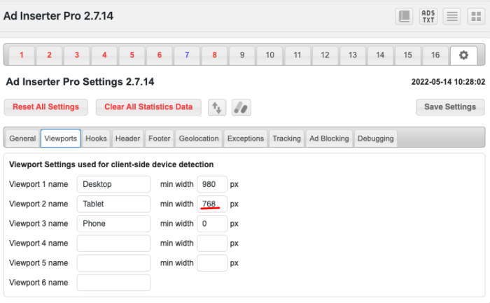
The tablet viewport starts at approximately 768px wide.
This is also the default value suggested by Ad Inserter

How the content or sticky ads look depends on the space you’ve allocated for the content container and sidebar.
I use GeneratePress on all my sites and the content is placed at 1300px and the sidebar takes 35% of that width.
With the help of a ViewPort Sizer, I gave myself the task of seeing how my site looks on tablets with ranges between 768px and 980px
The bottom line was simple, sidebars don’t look great on those screen sizes.
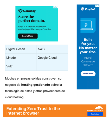
This is an example of what this site looks like with extremely thin 160×600 ads and a 728×90 ad

The content can be read but that two ads, plus the ads within the content provides a terrible experience.
That bad experience can lead users to look for the content somewhere else and give up reading your blog.
This is what the site looks like on Tablets with a 779×772 viewport

Since tablet visitors are in the minority and the 160×600 ad is not the best in terms of earnings, I decided to remove the right sidebar for tablets.
How to Remove Sidebars on Tablet?
Removing the sidebar can be done in different ways in different themes.
In my case, a CSS code created by GeneratePress support did the job in a good way
<style>
@media (max-width: 979px) {
    .site-content {
        flex-direction:column;
    }
    .container .site-content .content-area,
    .is-right-sidebar.sidebar  {
        width: auto;
        order: initial;
    }
    #main {
        margin-left: 0;
        margin-right:0
    }
}
</style>
So this is what users who visit my site from tablets experience

There are always ads but the experience is more balanced.


