The right sidebar is one of the options that I always enable on my sites.
The reason for doing so is basically monetization through Adsense ads.
The right sidebar being a “sticky sidebar” increases the visibility of the ad units on the site and that usually means more money per impression.
You can also use sidebars to promote content from your blog or links of interest or anything you want your visitors to see.
But, Do you think that we should I keep sidebars for Tablet users?
The Sidebar on Mobile Phones
As you know, the sidebar on mobile phones is located after the content, so the sidebar loses its meaning.
If you have ads in the sidebar, you will notice that the ads have less visibility on mobile devices.
My recommendation is to remove those units from mobile devices so they don’t affect earnings from Adsense ads or any other service you use.
The Sidebar on Tablets
Visitors who use tablets to visit my sites are a minority, so I had never paid attention to the subject.
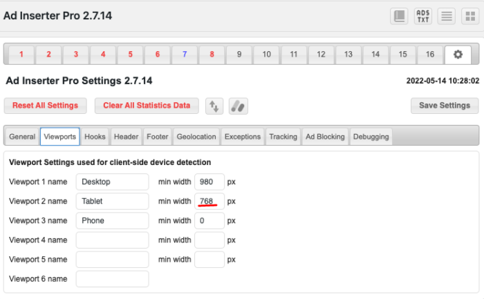
The tablet viewport starts at approximately 768px wide.
This is also the default value suggested by Ad Inserter
How the content or sticky ads look depends on the space you’ve allocated for the content container and sidebar.
I use GeneratePress on all my sites and the content is placed at 1300px and the sidebar takes 35% of that width.
With the help of a ViewPort Sizer, I gave myself the task of seeing how my site looks on tablets with ranges between 768px and 980px
The bottom line was simple, sidebars don’t look great on those screen sizes.
This is an example of what this site looks like with extremely thin 160×600 ads and a 728×90 ad
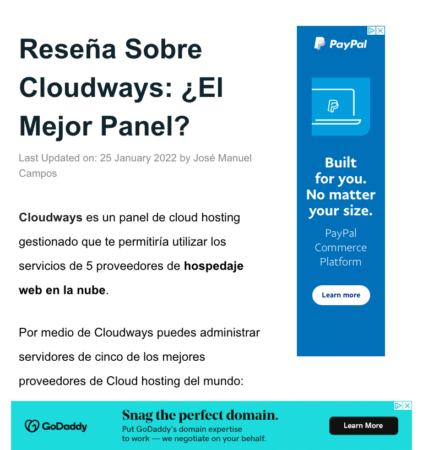
The content can be read but that two ads, plus the ads within the content provides a terrible experience.
That bad experience can lead users to look for the content somewhere else and give up reading your blog.
This is what the site looks like on Tablets with a 779×772 viewport

Since tablet visitors are in the minority and the 160×600 ad is not the best in terms of earnings, I decided to remove the right sidebar for tablets.
How to Remove Sidebars on Tablet?
Removing the sidebar can be done in different ways in different themes.
In my case, a CSS code created by GeneratePress support did the job in a good way
<style>
@media (max-width: 979px) {

    .site-content {
        flex-direction:column;
    }

    .container .site-content .content-area,
    .is-right-sidebar.sidebar  {
        width: auto;
        order: initial;
    }

    #main {
        margin-left: 0;
        margin-right:0
    }

}
</style>
So this is what users who visit my site from tablets experience

There are always ads but the experience is more balanced.


![How to Hide WordPress Version Number [Mu-Plugin]](https://wpsurfer.com/wp-content/uploads/2022/09/joan-gamell-ZS67i1HLllo-unsplash-300x200.jpg)